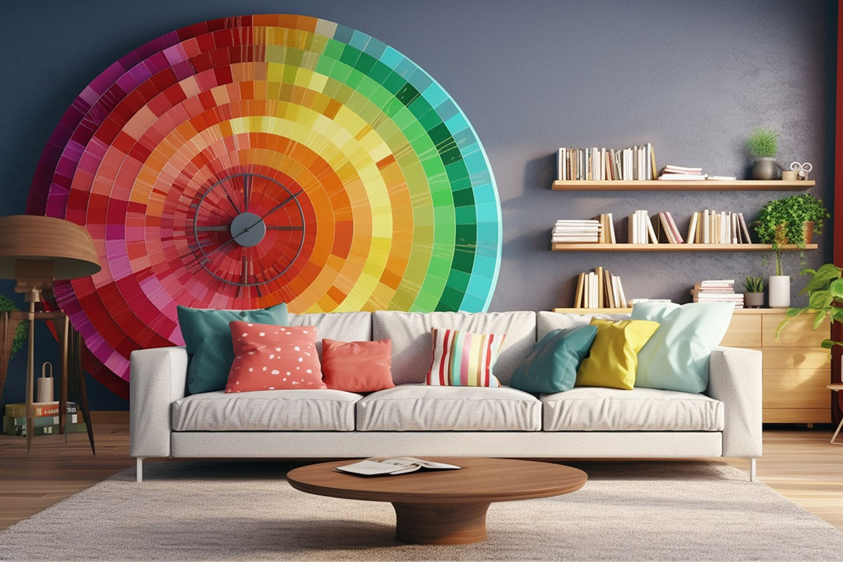
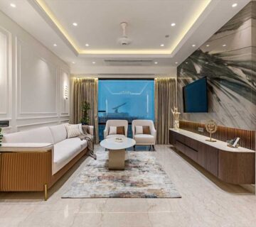
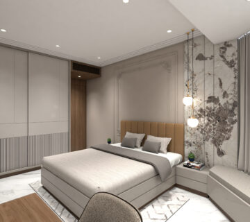
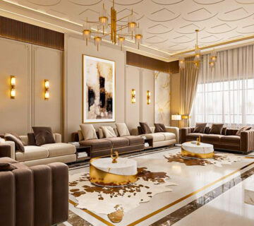
Color psychology in interior design plays a crucial role in shaping the atmosphere of a space. The colors you choose can influence emotions, enhance moods, and even impact productivity. Have you ever noticed how some rooms make you feel calm and relaxed, while others energize or overwhelm you? This is because different shades evoke different feelings. Warm colors like red, orange, and yellow create excitement and warmth, while cooler tones like blue and green promote relaxation. Understanding how colors affect emotions allows you to design spaces that feel harmonious, balanced, and visually appealing.
Color psychology, in design offers guidance, on selecting the hues for your living environment.
Understanding How Color Impacts Mood in My Interior Design
Marketing is not the only aspect of color psychology that is felt in the realm of direct marketing, which is also part of color psychology. You can also enhance brand recognition with accent wall ideas that use your corporate colors, but make sure to go for other colors that will help to set the right mood for your design. Colour harmony in the interiors helps to set a balanced and a welcoming environment where all the colours are there to add beauty and comfort to the space. It is quite simple to design a room with grey and white colours.
They are also a good basis on which to build other, more daring design elements, such as wallpaper or flooring, thanks to their clean and quite sophisticated appearance. Warm and cool tones create various atmospheres:
- Red: The color that has passion and excitement radiated in it is red. If you are planning to use a creative space such as a meeting room or an outdoor area then red and its adjacent colors are ideal.
- Blue: Blue calmness and tranquility sense do wonders in bedrooms and offices as well, emitted by.
- Green: As a growth and renewal color, and also a color of balance, green is a good upholstered color for an office.
- Yellow: This color will help to bring out feelings of happiness, confidence and optimism and looks wonderful in hallways and dining rooms.
- Orange: The color orange is known to have a positive effect on mood, making people feel more enthusiastic, sociable, and creative. In addition, it increases appetite; therefore, it is a suitable color for dining rooms.
- Purple: As a color of originality and creativity, and also of luxury, purple is a good choice for studios for art and meetings.
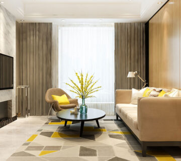
- Gray: A grey colour can bring about a feeling of pragmatism, sophistication and delicacy. If combined with the correct colours, people can have a positive association towards grey.
- Brown: Representing stability, earthiness and comfort, brown is a great base color as it complements many other accent colors.
- White: The purest, cleanest, freshest color is white; this color is suitable for linens and towels because of their purity.
- Black: Black – sophisticated, bold, mysterious. This functional color is usually used in professional environments for its elegance, though it is a black.
How Color Impacts My Interior Design
The color of a performance fabric is key in setting the mood and functionality of the space. Colors should be chosen wisely in bedrooms, workplaces, outdoor locations and common areas. It also affects the colour perception. Natural and artificial lighting can alter the colors of the objects. The higher the lightness of the light, the higher the saturation of the color.
Communal Areas
Communal Areas Performance fabrics in neutral or muted colors help to create a calm and welcoming ambiance in living rooms or lobbies. You can easily incorporate accent colors into this space because the space feels so open. Energy can be brought to it and can help with social interaction if bright colors are used. Earth tones like greens and browns are a connection to nature and will give a sense of comfort.
Bedrooms
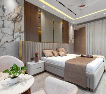
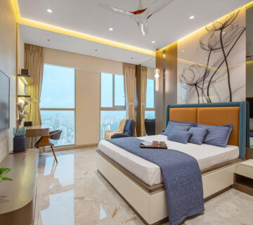
You can enhance your sleep quality and relaxation by choosing the right color for your bedroom. The light grey or pale blue headboard is calming and pairs well with the decor. By painting the walls a darker color, like charcoal or navy, you can create warmth and intimacy in a room.
Workspaces
Focus and productivity are easily affected by the colors of the workspace. Creative juices are known to flow when one is surrounded by the bright stimulating colors of yellow, while concentration is enhanced by the softer shades of blue or green. When choosing ergonomic seating, curtains, or cushions, it is recommended to select high performance fabrics that provide excellent comfort and performance. You don’t want any distractions and you want to achieve a clean and professional look so go for cool and neutral colors.
Outdoor Spaces
Besides having useful applications, colour is one of the aesthetic components of outdoor furniture. The heat reflective colours that are bright, such as blue or red, relate the outdoor design to nature. Darker coloured fabrics, however, prevent the accumulation of heat, making seating areas cooler. Light coloured fabrics will help to keep seating areas cool. The earthy tones will match well with the surroundings and will create a nice transition between the interior and exterior of the house.
What Impacts Color Perception in My Interior Design?

The selection of the fabric also determines the color perception. Colour is perceived differently on different textures of the fabric. When light falls on any fabric it will either absorb it or reflect it thus changing the appearance of colors.
The surface of a fabric has the ability to absorb or reflect light, which in turn alters the appearance of colors. It also has been observed that smooth textiles are light reflecting and are made of synthetics, which make colors of objects appear brighter and more intense.
On the other hand, there are textures that are rough, including natural fibers or cotton, which scatters light and makes colors appear dull or softer.
The characteristics of a color however can also alter the mood it conveys – this refers to the hue and these characteristics:
- Tone: This paper discusses how gray effect, interact with and combine with other colours to either darken or lighten them without altering their hue. It could also help to determine the level of brightness or darkness of a colour and how vibrant or dull it is.
- Shade: Black is a color that adds intensity and depth to any other color by making it darker. This simple color has a powerful effect in fashion, art, and everyday life. Value: Color value is how dark or light a color is, and how it creates contrast.
- Tint: The addition of white to a color makes it lighter and changes the tint to govern how bright it is.
- Saturation: Saturation is a term that describes a color’s intensity or purity. Vivid and rich are high saturated colors, and low saturated colors are more muted.
How to Adapt to Seasonal Color Trends in Interior Design
It is very important to choose an adaptable palette in the interior design. White, black and beige are neutral colors schemes that are classic and can be used in most spaces.
These colors can form the basic color scheme of corporate spaces and, should a change be required, introduce the use of seasonal colors as accents. For instance, a hotel lobby with neutral walls could potentially save on renovation costs by swapping upholstery and using trending or seasonal colors to create a look that will appeal to guests.
At the moment, the trends in interior design are rather subdued and neutral – muted – ones. Hotels and offices are both using biophilic hues, with forest greens and warm browns that help to create a soothing environment. These colors are also quite able to go well with the bolder accents, say, terracotta red or sky blue in seating or curtains, which helps to give the space some extra liveliness and individuality, without going over the top. They are also versatile enough that they can be used almost anywhere – from the lounge to meeting rooms.

